One reason why i was brought on board was to help create and maintain the company’s design system and improve the workflow between the marketing team, graphics team and developers.I collaborate with one other designer and a small group of front end developers in creating S&S DS.
Over the years S&S product Devmio & Enwickler.de has evolved with each of them having a robust sub- brand although connected but still different in a unique way as devmio cater to the international community and enwickler the german community. There is need to ensure an harmonious design system that is scalable.
My first focus was on building a flexible yet consistent design component system for our suite of conference websites. These included DevOpsCon, iJS, MLCon, JAX, and BASTA!, each with unique color systems representing different locations as well as a set of global brand colors. I began by auditing existing UI components, identifying inconsistencies and accessibility issues, and creating reusable variants that could adapt to each brand’s theme without breaking layout or readability standards. I collaborated with developers early to ensure handoff was smooth and integration-ready.
To ensure team alignment for the graphic team, marketing team and developers, I documented usage guidelines and interaction behaviors. These included clear references for primary, secondary, and location-based color mappings, component states, spacing, and responsive rules. The final system was designed to support scalability whether a new city is added or a brand needs to shift tone, the UI could evolve without starting from scratch.
- Seamless workflow between teams - Engineers no longer need to rebuild Ui element from scratch
- Brand and corporate Identity alignment - Able to manage the multiple colors across platform
- Effiency in designing - We were able to focus on solving real problems across conference website rather than designing new components
- Consistentcy in marketing and brand design - Both designers and the marketing team building with elementor could focus on solving problem instead or creating new components
The first attempt covered a lot of ground especially across our conference websites and marketing needs but it didn’t scale beyond that. The system lacked support for other key areas like our platform website, print materials, and social media assets, which led to inconsistencies in execution and brand expression.
We also noticed a disconnect between design and development. Even when components were implemented correctly, the turnaround time was long. In some cases, developers had to interpret missing details or rely heavily on clarification, slowing down the build process. It became clear that the system needed to be updated, extended, and made more practical for day-to-day implementation across all touchpoints

Platform Developers:
They emphasized the need for a redesign of existing components, improved accessibility, and a more structured, consistent application of colors. While entwickler.de required a more serious and editorial CI, devmio needed to preserve its friendly, playful tone.
Marketing & Web Teams:
Shared that while components existed, they lacked a uniform structure and were often rebuilt or tweaked for different campaigns. They needed a shared language to align better with the design system across CMS and custom builds.
Graphic Design Team:
Expressed concerns about visual inconsistency. Assets often felt disconnected fonts, colors, and layout choices varied too widely. There was also confusion around what should be reused vs. newly created for specific use cases.
With the knowledge of how broad and unique our product is we decided to approach this by conducting a component audit and document findings, this helped us identify inconsistencies in existing components and redesign patterns across all our platform.
We then proceed to prioritize high-impact components across platforms (e.g, buttons, forms, typography, spacing) and align with the development team on feasibility and current implementation gaps. We built over 300 components so far and more actively being developed. Each component includes comprehensive usage guidelines, relevant links, and practical examples, making it easier for the team to work effectively and confidently without much oversight.
- Icons were misaligned in stroke weight, size, and style, lacking visual harmony.
- Shared components such as cards, modals, and input fields had different implementations across each platform, leading to fractured user experiences.
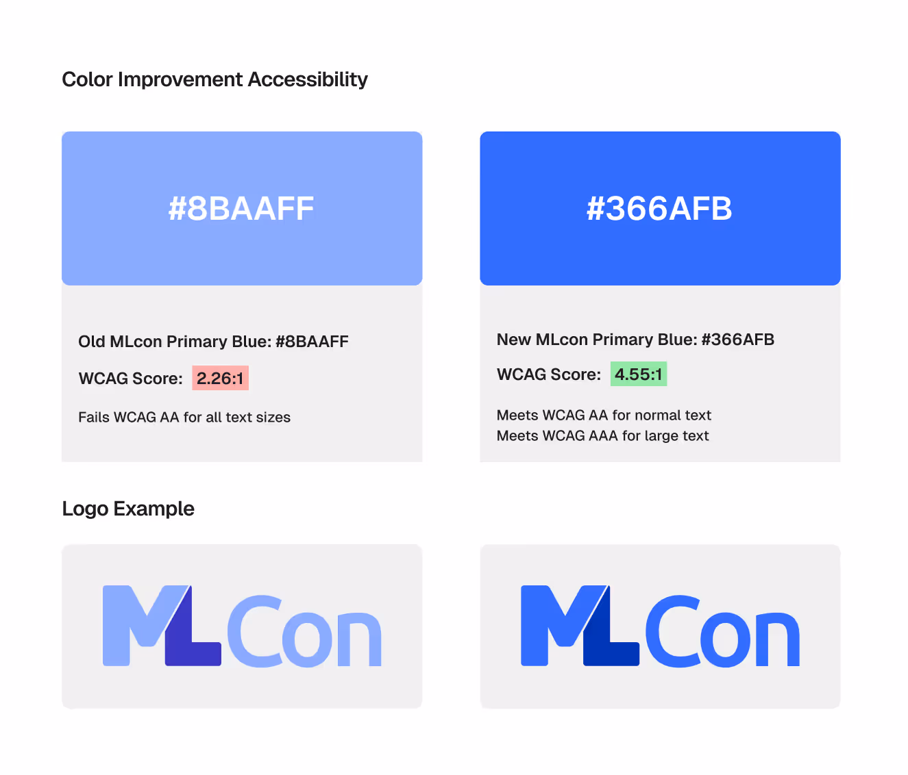
- The color system had grown overly complex. Many colors were undocumented, redundant, or failed to meet WCAG accessibility standards making design decisions slower and inconsistent.
- There was no single source of truth for spacing, typography scale, or component states, which made it difficult for teams to collaborate or reuse components effectively.
- Buttons varied in font size, corner radius, color, and hover states across websites.
Our audit revealed deep inconsistencies across the platforms—both visually and functionally:
We redesigned the button system to be visually cohesive across all platforms while allowing for brand-specific adaptations. States (hover, active, disabled) are clearly defined, contrast ratios have been improved for accessibility, and documentation provides guidance on sizing, spacing, and usage context.
We drastically reduced and restructured the color palette. Colors are now grouped into global (neutral, semantic) and brand-specific categories with defined use cases. We also reviewed all colors for accessibility and ensured contrast levels meet WCAG AA/AAA where applicable. Documentation now includes usage examples, tokens, and naming conventions to reduce ambiguity for designers and developers alike.
We standardized icons using Material Design’s icon set to ensure consistency in stroke weight, sizing, and alignment. This helped unify the UI language across platforms and reduce visual noise.
- Improved accessibility: Components now meet color contrast and sizing standards.
- Faster design-to-dev handoff: Clear documentation and tokens allowed developers to implement designs without delays or guesswork.
- Cross-platform consistency: UI now looks and behaves consistently across conference sites, the main platform, and marketing assets.
- Increased design efficiency: Designers no longer spend time reinventing components or resolving conflicts in visual language.
Build incrementally
Tackling components one by one and validating them through real use cases ensured higher adoption.
Involve stakeholders early
Engaging platform developers, brand designers, and marketing teams from the start helped identify hidden friction points.
Don’t underestimate documentation
Clear and visual documentation is just as important as the components themselves.
- Expand the component library to cover edge cases and future needs.
- Develop color variants for light/dark modes and seasonal themes.
- Establish tokenized design variables for easier dev integration and theming.
- Introduce a feedback loop and governance model to evolve the system continuously.


.gif)